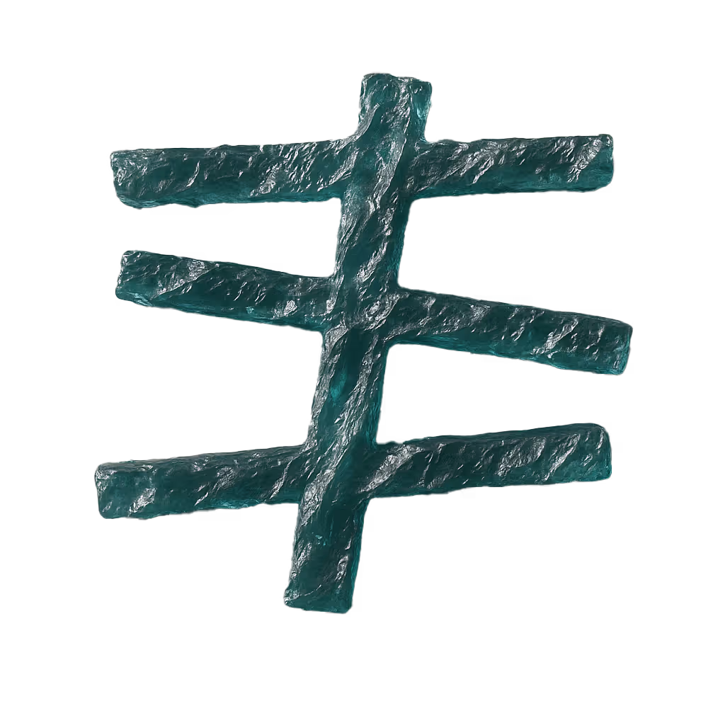
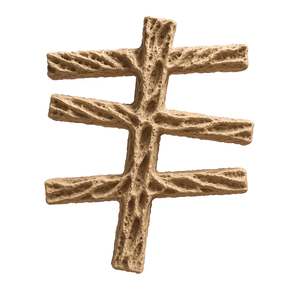
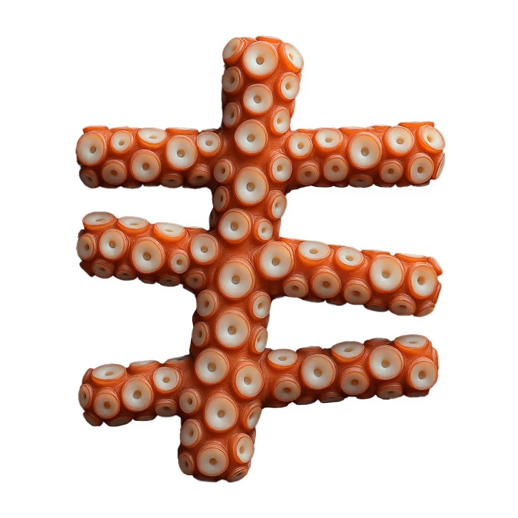
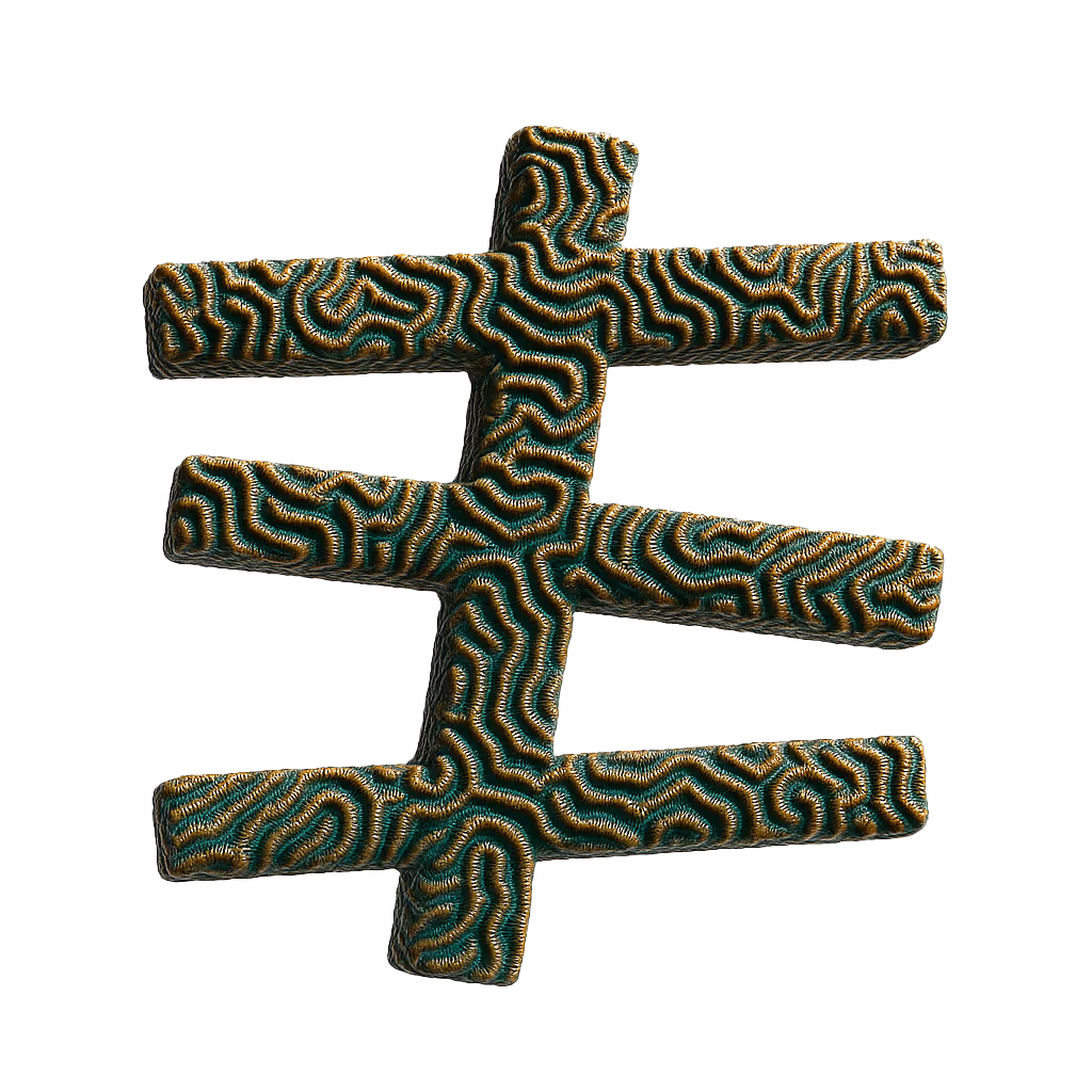
We’re not here to overdo it, so the key here really was “less is more”. We maintained Z&Co’s already established visual identity with their signature green and grid-style system as a foundation. With that, we paired minimal yet playful elements that added to the interactive experience without taking away from the website’s functionality.
.svg)
.svg)