R-YN

For people who read the label.
And care what it looks like too.
Get in touch
Art Direction
Visual Identity
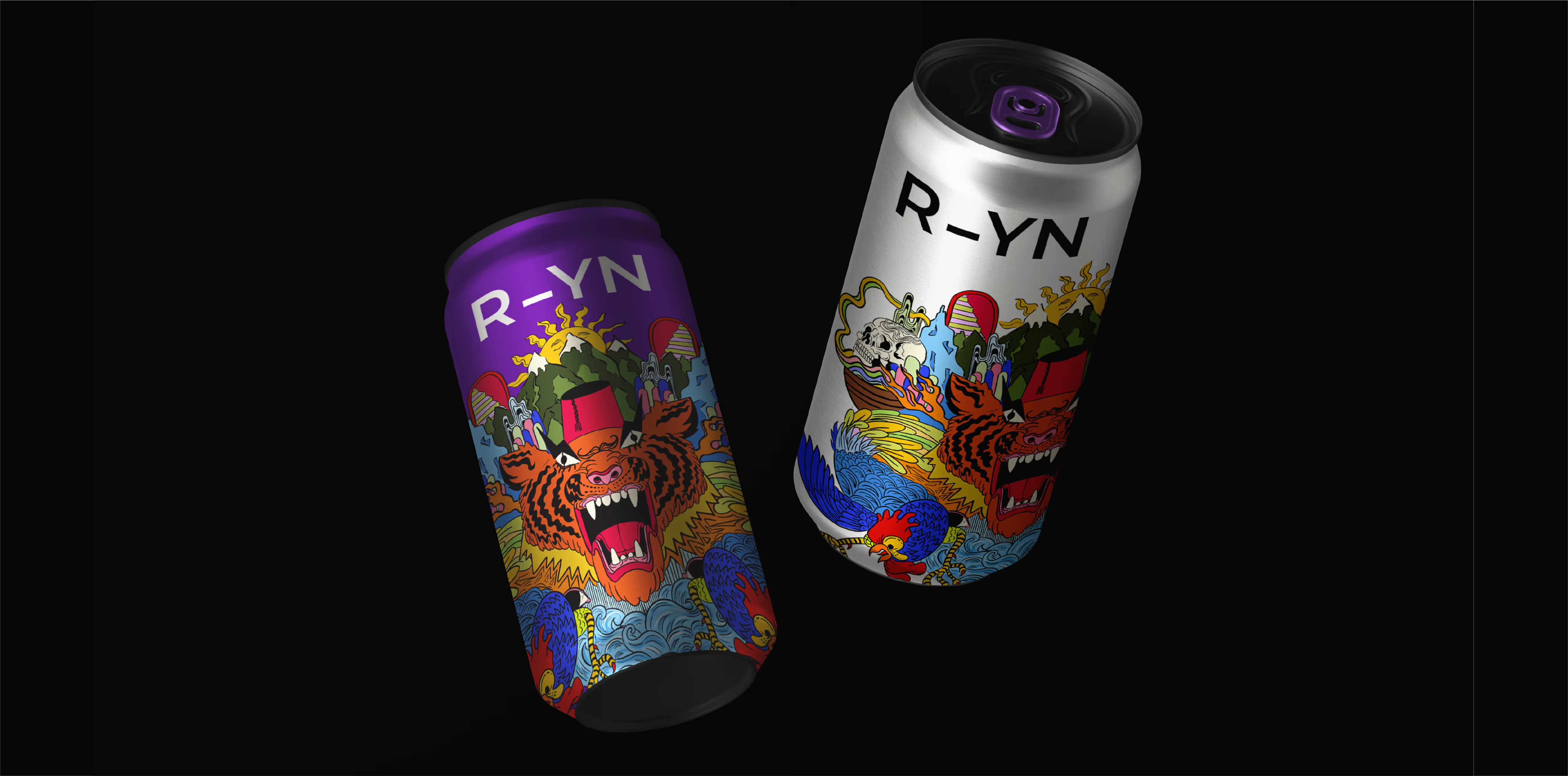
R-YN is a protein water brand without the gym bro energy. Light, clean, and fruit-forward. So the goal was clear: build a visual language that’s as lean as the product, but still knows how to stand out. Turning “low-cal, high-protein” from supplement-speak into a lifestyle statement.
Clean product. Clean white base. We created a color-coded system for clear flavor differentiation and straightforward product architecture. To offset our strong sans-serif mark, we blend with an organic illustration style - building a visual world that feels both structured and spontaneous.
Beyond R-YN’s classic product line comes their limited edition selection. We created custom artwork that breaks from their core identity - using contrast as a way to expand, not distract. 
More Projects
DRIPD
DRIPD
AB+P
AB+P
LK Engineering
LK Engineering