Sheen

Does it look or smell better?
Tough one.
Get in touch
Brand Strategy
Naming
Visual Identity
Art Direction
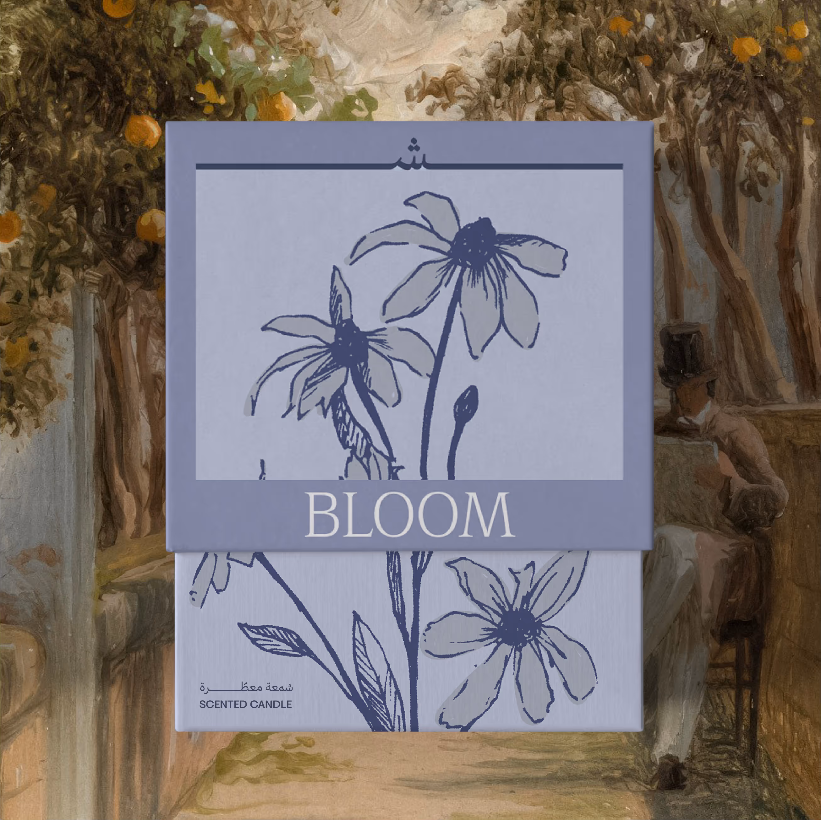
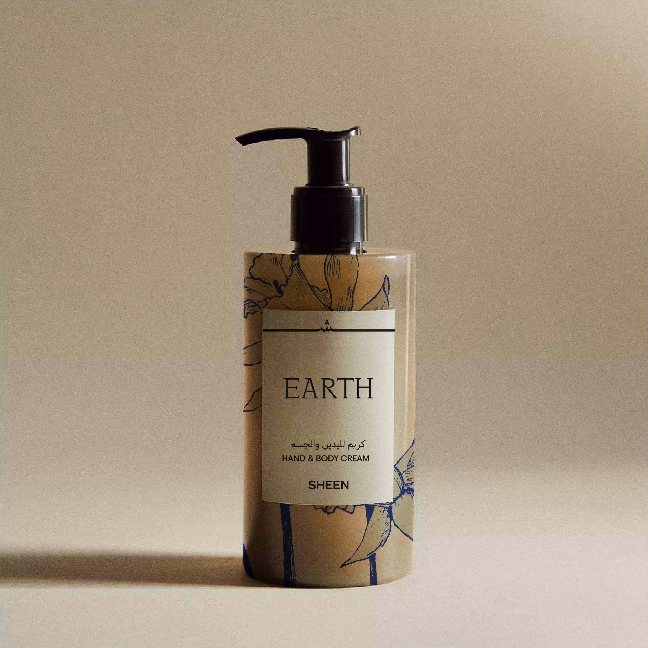
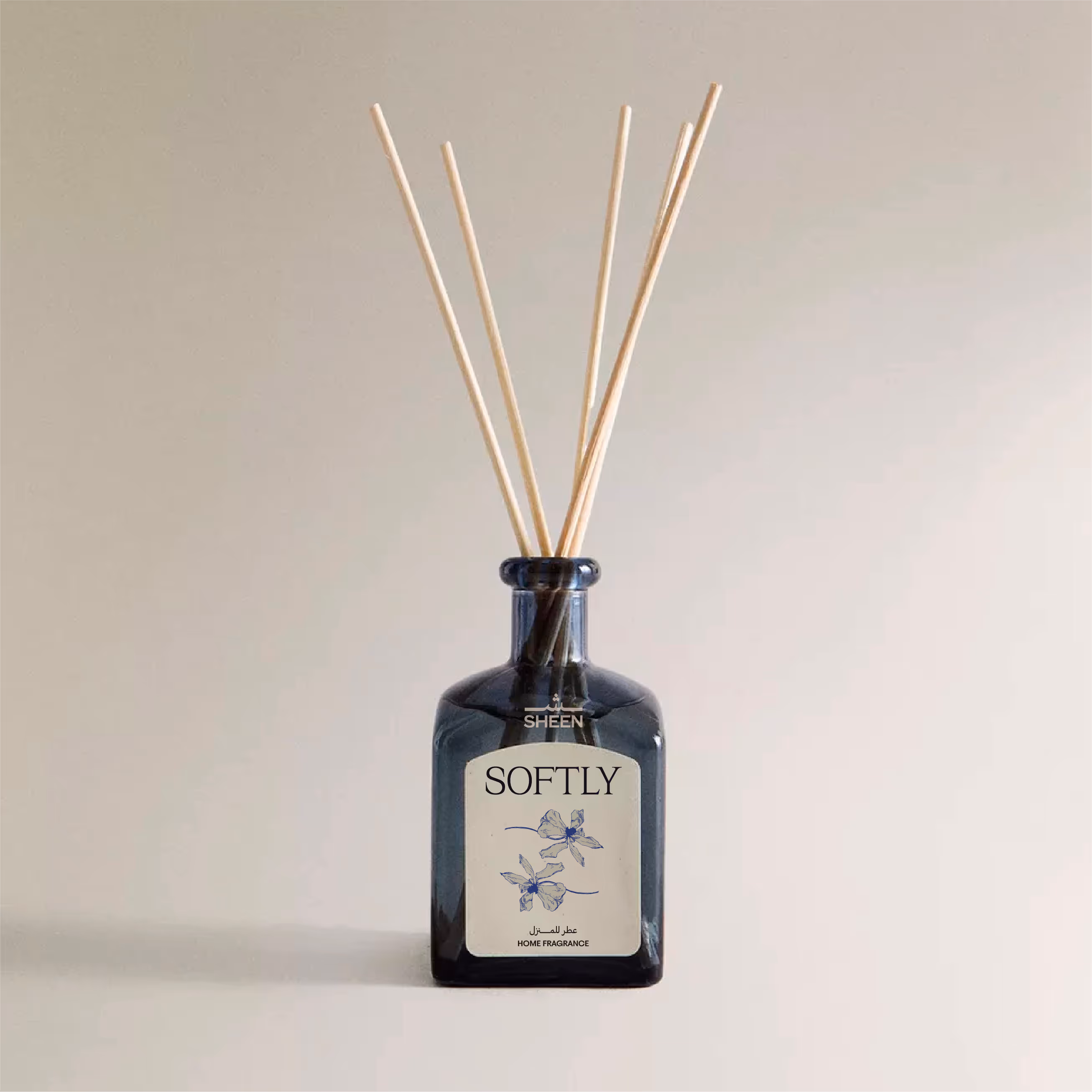
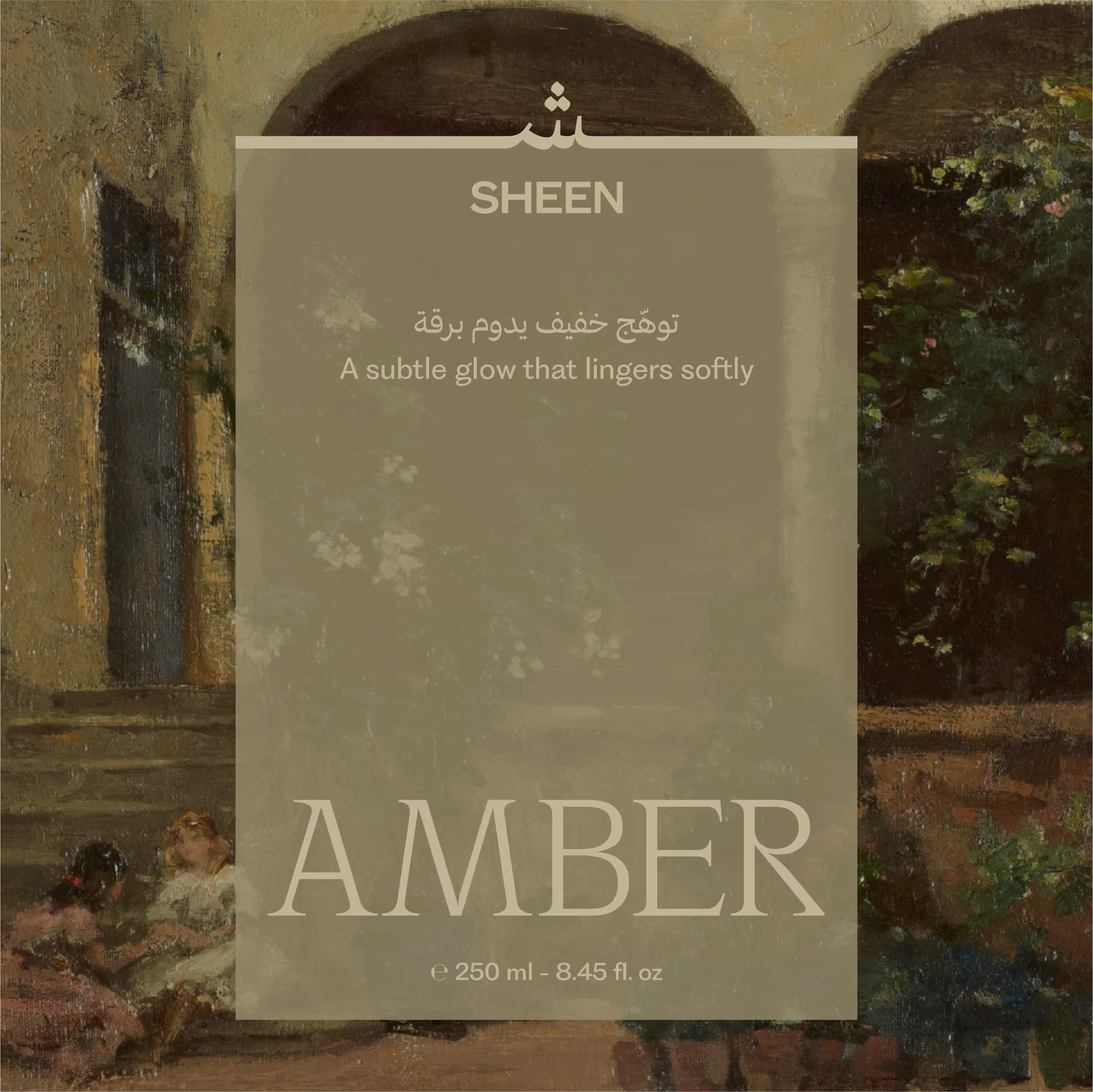
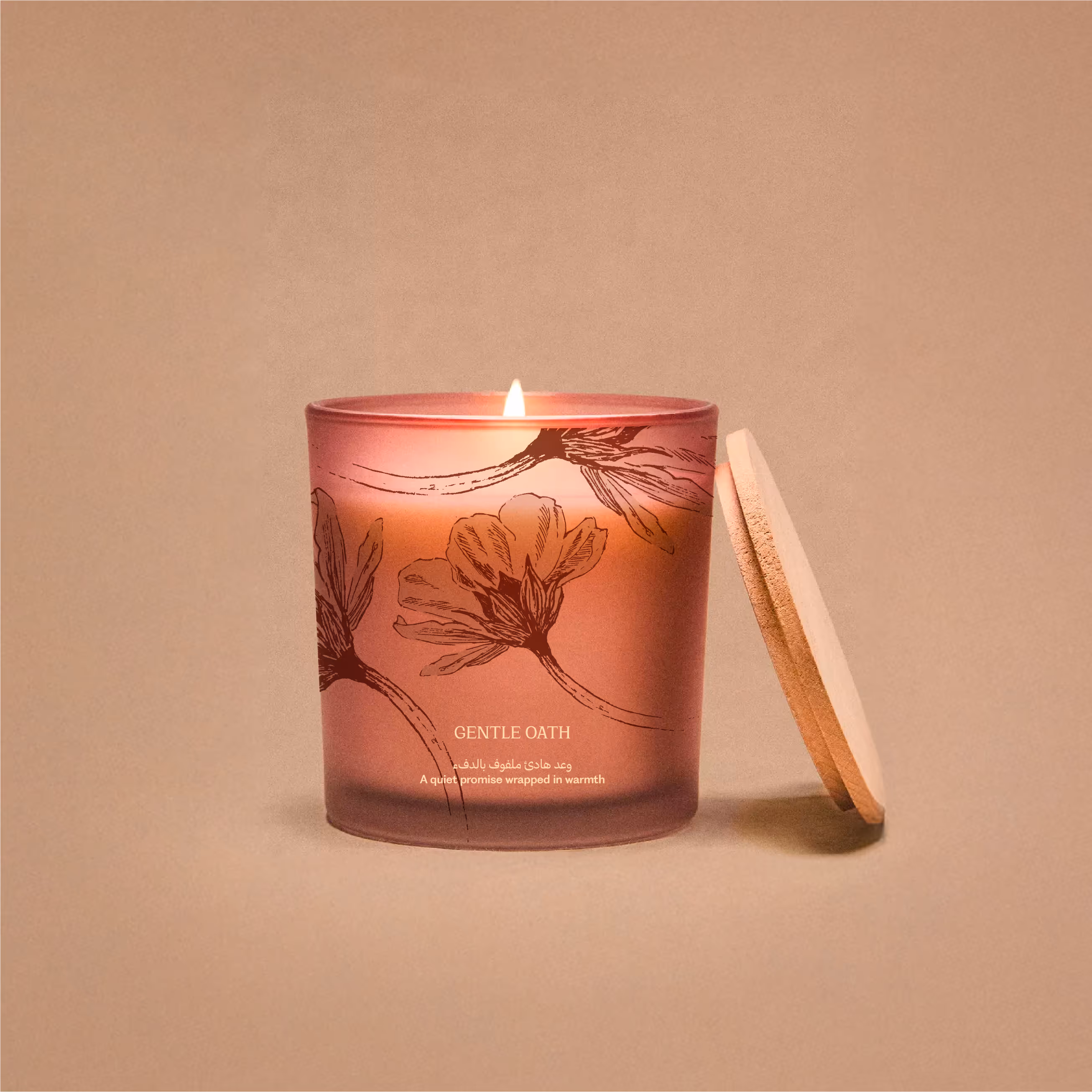
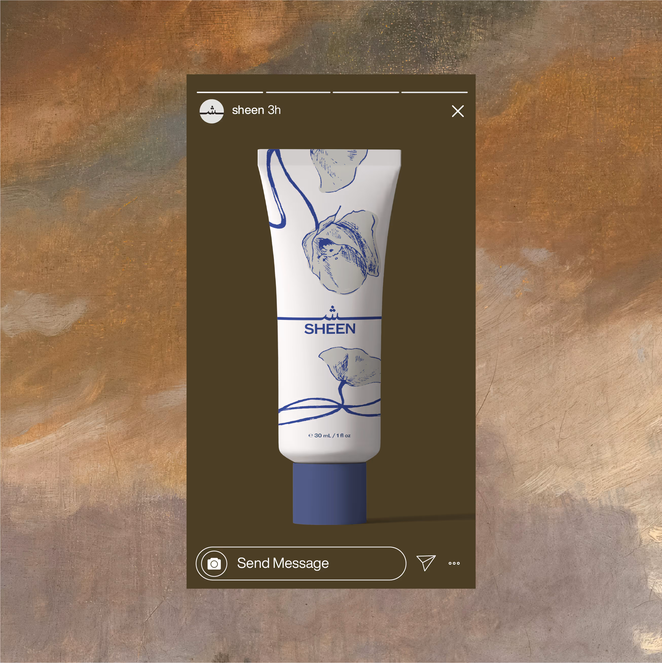
Sheen is a MENA-based brand built around quiet rituals — the kind that live in the background of your everyday. Our strategy: not a “beauty brand” or a typical cosmetics line. We positioned Sheen as a timeless, tactile experience rooted in nostalgia. Think old book covers and the chipped mug you'll never get rid of — things that feel like they’ve always been there. We named Sheen for its double meaning in both languages. In English: light, glow, and reflection. In Arabic: the letter sheen (ش), a subtle nod to where the brand comes from and who it’s speaking to.
We built a world that draws from vintage artwork and early print — textures that feel lived in and familiar. The illustration style takes cues from pressed flowers, drawn to hold both softness and structure. The Arabic mark works in a dynamic system across packaging, grounding each product and acting as a signature. Serif-heavy, high-contrast typography acts as a soft reminder to old soap bars and newspaper headlines – nostalgia reworked through a modern lens.
We positioned Sheen to move slowly. Scented candles, essence, lotions – sure. But it’s also soundless – muted, even. A brand designed to feel familiar and warm. 
More Projects
Toon
Toon
R-YN
R-YN
DRIPD
DRIPD