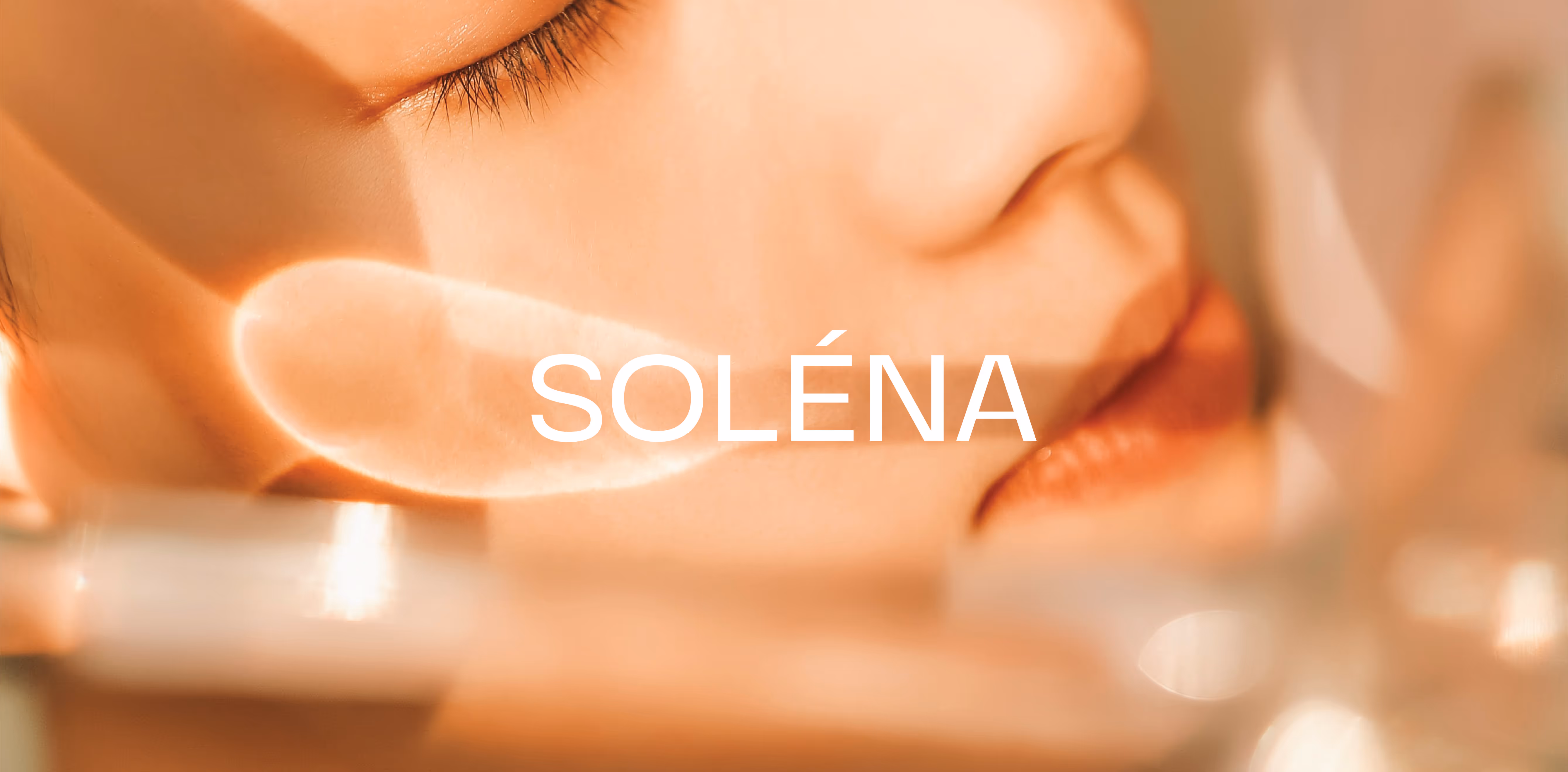
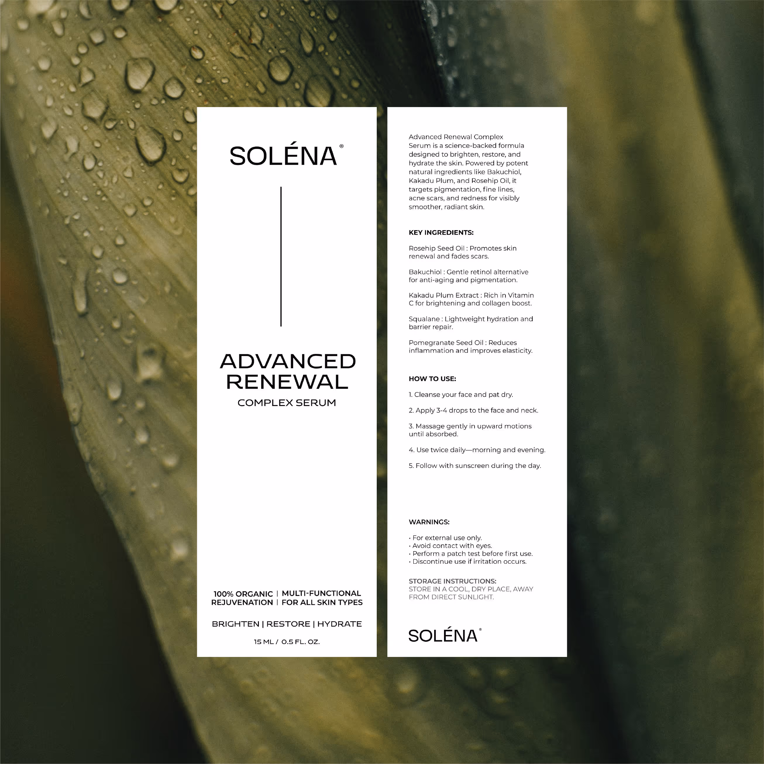
Korean skincare has been having its moment. Solena joined the wave, and we were there to shape the brand. We took an approach that embraces the clinical clarity of K-beauty, minus the clinic-y. The idea was to create a visual world that was clean but not cold, minimal but not bare. In other words - calm confidence.
K-beauty is all about balance and consistency, not quick fixes. With that in mind, we kept the visuals just as considered. Letting Solena’s signature stacked cap take the spotlight, we allowed typography to compliment, not compete.
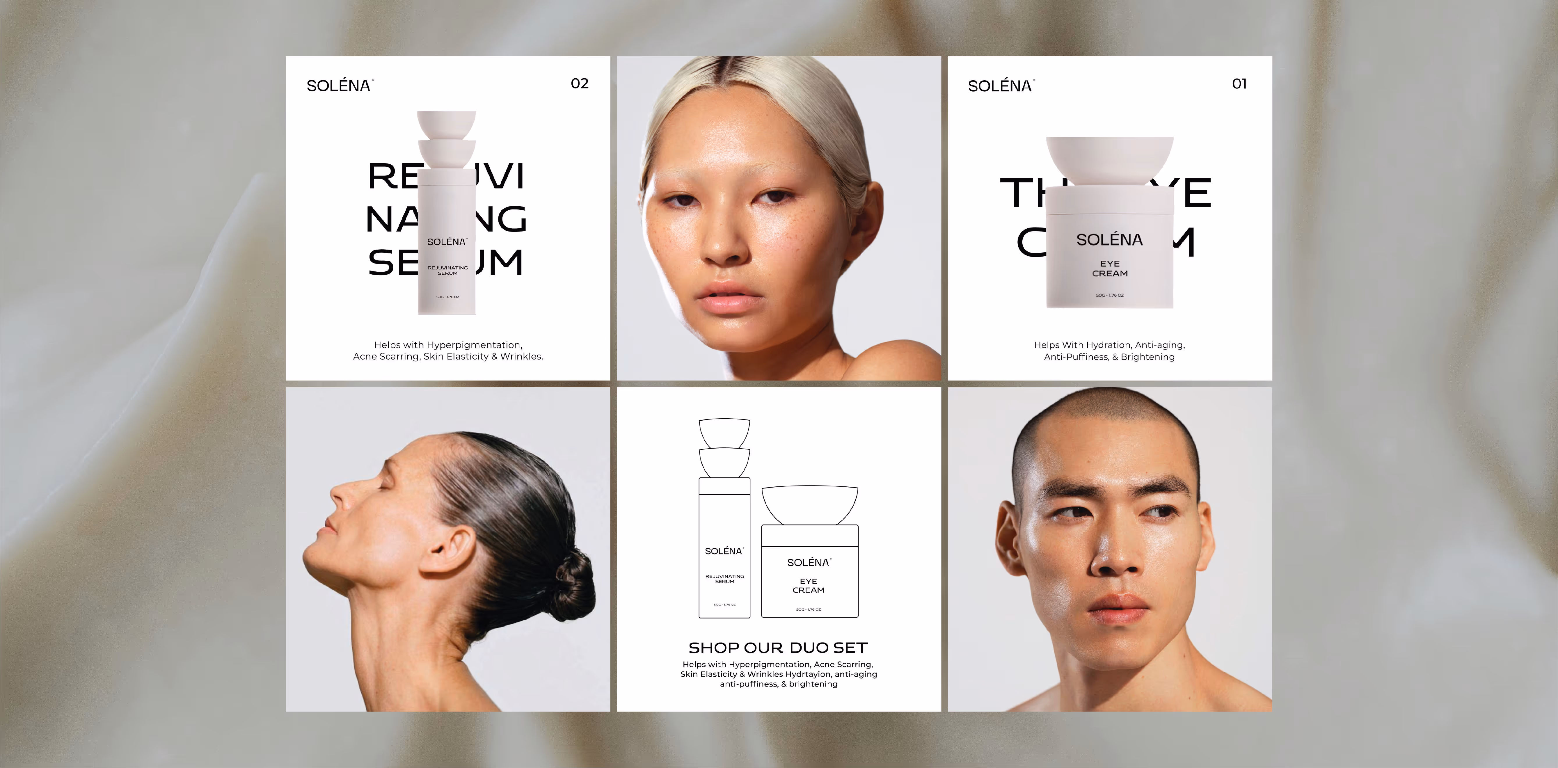
We carried the same line of thinking within our typographic approach to our photographic style. Pairing skin-focused shots with lifestyle moments to achieve the calm visual balance we were after. We let the products shine in a soft, relatable setting.
.avif)
.avif)
.avif)
.svg)
.svg)